
I've spent years helping people transform their wardrobes and one thing remains constant - mastering color coordination can make or break an outfit. Whether you're getting ready for work or planning a special occasion look it's essential to understand how different colors work together to create stunning combinations.
As a stylist I've noticed that many people feel overwhelmed when mixing and matching colors in their wardrobe. They stick to safe neutrals or classic combinations missing out on countless exciting possibilities. The good news is that color coordination isn't rocket science - it's a skill anyone can learn with the right guidance and a basic understanding of color theory.

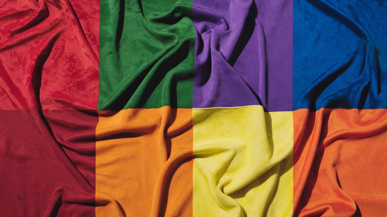
Understanding the Color Wheel for Fashion
The color wheel serves as a fundamental tool in fashion coordination, illustrating the relationships between different hues and their complementary partners. I've used this systematic approach throughout my styling career to create visually appealing outfit combinations.
Primary, Secondary, and Tertiary Colors
Primary colors (red, blue yellow) form the foundation of the color wheel in fashion. Secondary colors emerge from mixing two primary colors:
- Red + Blue = Purple
- Blue + Yellow = Green
- Red + Yellow = Orange
Tertiary colors appear between primary and secondary colors:
- Blue-green
- Yellow-green
- Yellow-orange
- Red-orange
- Red-purple
- Blue-purple
Warm Versus Cool Tones

Warm tones encompass colors associated with sunlight and heat:
- Red
- Orange
- Yellow
- Gold
- Coral
- Peach
Cool tones reflect elements of water and nature:
- Blue
- Green
- Purple
- Silver
- Gray
- Mint
|
Warm Colors |
Cool Colors
|
|---|---|
|
Energetic |
Calming |
|
Advancing |
Receding |
|
Stand out |
Blend in |
|
Daytime wear |
Evening wear |
|
Spring/Summer |
Fall/Winter |
Basic Color Coordination Rules
Color coordination follows specific principles that create visually balanced outfits. These fundamental rules serve as a framework for mixing colors effectively in fashion.
Monochromatic Combinations

Monochromatic outfits use varying shades tints intensities of a single color. To create depth in monochromatic looks, I combine:
- Light items: pale blue dress shirt textured blazer
- Mid-tone pieces: steel blue trousers fitted vest
- Dark elements: navy accessories structured shoes
Complementary Color Pairings

Complementary colors sit opposite each other on the color wheel creating dynamic contrasts. I recommend these proven pairings:
- Blue orange: navy blazer with rust-colored pants
- Purple yellow: lavender blouse with mustard skirt
- Red green: burgundy sweater with olive trousers
- Cool tones: blue purple indigo accessories
- Warm tones: red orange yellow statement pieces
- Nature-inspired: green blue teal layered looks
|
Color Combination Type |
Visual Impact |
Best Used For
|
|---|---|---|
|
Monochromatic |
Sophisticated elegant |
Formal occasions business wear |
|
Complementary |
Bold energetic |
Statement outfits casual wear |
|
Analogous |
Harmonious subtle |
Everyday looks seasonal transitions |
Building a Versatile Wardrobe
A versatile wardrobe starts with strategic color selection and thoughtful piece combinations. I've developed a systematic approach to creating a wardrobe that maximizes outfit possibilities while maintaining color harmony.
Core Neutral Pieces

Core neutral pieces form the foundation of a functional wardrobe. I recommend starting with these essential neutral items:
- Black tailored trousers for professional settings
- White button-down shirts in cotton poplin
- Gray wool blazers for layering options
- Beige chinos for casual versatility
- Navy sweaters in merino wool
- Tan leather accessories (belts bags shoes)
- Dark denim jeans in straight cuts
- White sneakers for casual pairings
The ideal neutral piece ratio is 70% of the total wardrobe, creating a reliable base for color mixing.
Statement Color Items

Statement colors add personality and create focal points in outfits. Here's my recommended color piece selection:
- Red accessories (scarves handbags ties)
- Emerald green blazers or structured dresses
- Cobalt blue knitwear pieces
- Purple silk blouses
- Mustard yellow cardigans
- Burgundy leather items
- Teal outerwear pieces
- Ruby structured tops
|
Category |
Recommended Quantity |
Wardrobe Percentage
|
|---|---|---|
|
Neutral Pieces |
15-20 items |
70% |
|
Statement Colors |
6-8 items |
30% |
Statement pieces work best when limited to 30% of the total wardrobe, ensuring balanced outfit creation options while maintaining visual interest.
Seasonal Color Coordination

I apply color coordination strategies based on seasonal changes to create versatile outfits that harmonize with both environmental surroundings and personal coloring. The seasonal approach ensures outfits remain visually appealing throughout the year while maintaining comfort and style.
Adapting Colors for Different Seasons
I recommend adjusting color palettes to match seasonal characteristics:
Spring Colors:
- Light pastels: mint green, blush pink, lavender
- Bright yellows mixed with crisp whites
- Fresh neutrals: beige, light gray, ivory
Summer Colors:
- Vibrant brights: coral, turquoise, sunshine yellow
- Light-to-medium blues paired with whites
- Cool neutrals: light gray, taupe, silver
Fall Colors:
- Rich earth tones: burgundy, rust, forest green
- Deep oranges combined with browns
- Warm neutrals: camel, chocolate, cream
Winter Colors:
- Deep jewel tones: emerald, sapphire, ruby
- High-contrast black and white combinations
- Cool neutrals: charcoal, navy, pure white
Skin Tone and Color Selection

I base color selections on three primary skin undertones:
Warm Undertones:
- Gold jewelry enhances natural coloring
- Earth tones: camel, coral, golden yellow
- Warm browns paired with cream
Cool Undertones:
- Silver jewelry complements skin tone
- Jewel tones: emerald, royal blue, fuchsia
- Cool grays mixed with white
- Both gold and silver jewelry work well
- Universal colors: true red, navy, pure white
- Medium browns combined with gray
|
Skin Undertone |
Best Colors |
Colors to Avoid
|
|---|---|---|
|
Warm |
Coral, Peach, Golden Yellow |
Ice Blue, Fuchsia, Purple |
|
Cool |
Royal Blue, Ruby Red, Emerald |
Orange, Bright Yellow, Brown |
|
Neutral |
Navy, True Red, Pure White |
None (all colors compatible) |
Advanced Color Mixing Techniques
Advanced color coordination elevates outfits beyond basic combinations through strategic pattern mixing color blocking techniques. These methods create visually striking ensembles when executed with precision.
Pattern and Print Coordination

Pattern mixing creates dynamic outfits through deliberate contrast control. I recommend starting with two patterns of different scales - one large (floral prints leopard spots) one small (pinstripes polka dots). The patterns must share at least one common color to maintain cohesion. Here's an effective pattern mixing guide:
- Pair geometric with organic shapes: Stripes with florals plaid with animal prints
- Match pattern scale ratios: 3:1 for bold contrast 2:1 for subtle coordination
- Balance busy patterns with solid colors: 60% solid 40% pattern distribution
- Coordinate pattern colors: Use the dominant color from pattern one as an accent in pattern two
- Follow the rule of thirds: 60% dominant color 30% secondary color 10% accent
- Create depth through contrast: Light colors advance dark colors recede
- Position colors strategically:
- Vertical blocks elongate
- Horizontal blocks widen
- Diagonal blocks add movement
- Use neutrals as boundaries: Black white or gray separates intense color combinations
|
Color Block Proportions |
Percentage
|
|---|---|
|
Dominant Color |
60% |
|
Secondary Color |
30% |
|
Accent Color |
10% |
Conclusion
Mastering color coordination isn't just about following rules - it's about expressing your unique style with confidence. Through my experience I've learned that understanding color relationships transforms the way we approach our wardrobes and opens up countless styling possibilities.
I encourage you to start small by experimenting with basic color combinations and gradually venture into more adventurous pairings. Remember that your personal comfort level and skin undertone should guide your choices. Whether you're creating a capsule wardrobe or planning statement outfits the principles I've shared will help you build cohesive and visually appealing looks.
Now it's your turn to embrace color coordination and make it work for you. Trust your instincts and have fun with it!
Leave a comment
This site is protected by hCaptcha and the hCaptcha Privacy Policy and Terms of Service apply.